Buttons or text links? See which performs better on your link in bio page, with real examples, A/B test data, and tips to improve your CTR using vip.bio.
Buttons vs. Text Links: Which Converts Better on Your Link in Bio Page?
You’ve got a few seconds to earn a click. So how you present your links matters — a lot.
Should you use big buttons or minimal text links? Let’s break it down.
🆚 Round 1: Visibility & Attention
Buttons win. They grab the eye, especially on mobile. A bold button labeled “GET THE GUIDE” is far more likely to be tapped than a plain blue underline.
But… text links can feel more subtle and less “salesy,” which some audiences prefer (especially in professional contexts).
🆚 Round 2: Mobile Experience
Buttons are touch-friendly, easy to tap, and align perfectly in a scrollable layout. Text links, though functional, can be missed — especially in busy or icon-heavy designs.
✅ Winner: Buttons (mobile > desktop)
🆚 Round 3: Branding & Design Flow
Buttons:
- Consistent with color scheme
- Can be animated
- More expressive with icons
Text links:
- Sleek and minimalist
- Blend naturally with editorial-style content
- Great for nested lists, footnotes, or secondary CTAs
➡️ Ideal combo: Button for primary action, text link for secondary (e.g. “Need help?” or “See details”).
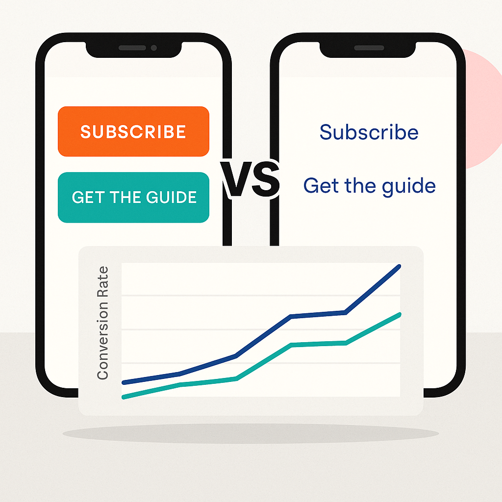
🧪 A/B Test Results (Real Example from vip.bio Creator)
Scenario: A creator promoted a free eBook using two variations over 2 weeks:
- Button Version: “Get My Free eBook” → orange button 📈 9.4% CTR
- “Get My Free eBook” → orange button
- 📈 9.4% CTR
- Text Link Version: “Click here to download my free eBook” (underlined) 📉 5.6% CTR
- “Click here to download my free eBook” (underlined)
- 📉 5.6% CTR
➡️ Result: Button converted 68% better
🎯 Final Verdict:
Use buttons for your main actions. Use text links for context, extras, and backup clicks.
Your link in bio page = a funnel. Design every link with purpose.